| oOoLeonarditeoOo |
|---|
|
sign my guestbook Name: Leonardite State: North Dakota Birthday: 1/24/1984 Gender: Male Interests: music, girls, surfing, sports, walrus hunting, having fun LOL!!!!! Expertise: Rigging the main sail on a 1600's era pinnace Occupation: Archduke of Romania Website: visit my website AIM:  thomasdolbyrocks44 thomasdolbyrocks44Yahoo: None.......yet!!!!!! Member Since: 2/31/2002 |
| SubscriptionsSites I Read |
|---|
| i used to suscrbie to lots of pepole, but since we ogt into a fight, i don't. but i bet you are all still reading jerks!!!!!!!! |
| My Blogrings Tenacious D Middle Finger Ring |
|---|
Wednesday, April 5, 2006
|
Featured Blog: the305hustler The people that maintain personal blogs are an interesting lot. If they're not obsessing over a can't-miss romance with their uncle's neighbor three states and two chat rooms away, bloggers are busy trying to decide which maudlin Kenny Chesney line best sums up this unattainable romance. But having said that, we've already hit a stumbling block... Undoubtedly, some of you read the first sentence and said, "I've seen blogs before and I've never seen anything that resembles 'maintenance.' Most of them look like they were raped by illiterate hackers with a hardline agenda to rid the world of easy-on-the-eyes web destinations." Believe me, I'm in agreement. But with the efficiency levels that the blogging communities have been performing at for pedophiles and various freaks, I feared that a reference to the "molesters of the internet" would be taken on a literal level. The simple and obvious fact is that weblogs on the whole are the most aesthetically unpleasing things since mad scientists cloned the three-toed feces monster in Namibia. There is no code or charter by which to create blogs - taking the three minutes to read such directions would take three times as long as most people take to build their entire page. While Xanga certainly has its fair share of HTML eyesores, Myspace takes the cake. Myspace pages are so unbelievably random and so indescribably ugly that I find it almost impossible to post them on here. The birth of a Myspace follows a loose set of guidelines like the ones below: Step 1) Insert a HUGE Miller Lite can as your background. Make sure that this image is not centered; it should tile numerous times and climax in the always beautiful half-can on the right side and bottom of the page. 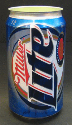 Step 2) Text color should be light green or any other pastel color that will disappear into the can and its white border.
Step 3) Brainstorm with friends on a terrible music video to have looping somewhere on the page. The media player should be tucked into the most remote area of the page so that even if someone wants to shut off the nonsense, it takes forever to find. Bonus points are awarded if the player exhibits frequent buffering problems and locks up the user's browser. This is the hallmark of a sturdy and thought-out website. Step 4) Another pointless video or plain mp3 should be playing at some point on the page. Most users who log onto the internet are looking for a saturating audio clash of unexpected songs and video, so the more you can make the sound coming out of their speakers resemble the noise of a man falling down in a hardware store, the better. More bonus points are awarded in this category if the secondary player also possesses browser freezing prowess. Step 5) Fill out a LOT of surveys. One is definitely not enough. If your Myspace page has less than two surveys on it, everyone is going to be pissed, not the least of which is the government. Multiple-survey sites are in full compliance with the Patriot Act, although you could make the jobs of our loafing bureaucrats a lot easier if you replaced questions like "Do you have a crush? Yes <3" with queries like "Have you ever smuggled weapons in your turban? Have I ever!" Step 6) The percentages are infinitesimally small, but on the off chance you have a concept of what proofreading is, abuse the nearest Kharkov bottle until you have forgotten. Proceed to enter a blog entry or two, throwing in as many random capitalizations and five-minutes-ago pop culture lines as you are capable of. Step 7) Accentuate the site with a lot of seemingly unrelated images. So what if your blog is primarily about your college softball team? There's no reason not to throw a giant Ron Burgundy in the middle of the page! That picture of your horse doesn't match up with the beer can? I bet it will if you compliment it with an even bigger picture of the Baywatch cast next to a Peter Griffin animation still. Step 8) Put a bow on the site by leaving a huge empty space at the bottom of the page. The endless void should be longer than the site itself and should provide for at least twenty-seconds of unfulfilling scrolling for your guests. There probably are dozens of sites out there that operate off the blueprint I just broadcast. But I respect myself enough not to dig through awful Myspace pages to find them and instead of settled on one that is like a good grenade toss..........close enough.
The Blog
General Interests i like 2 chill wit my friends(mostly all of them r Colombianos). and gerlz oh ya did i mention gurlz. --> START YOUTHINK.COM QUIZ RESULTS --> When I read this, the part of my brain that processes awesomeness nearly ruptured. I understand that it's against protocol to type correctly spell "girls" on the internet, but the fact that he used two WHACKED OUT(!!!) spellings in the span of seven words is a commendable feat. This is amplified by the very subtle transition into the quiz results. Fine work. Music Video Pretty Fly (For a White Guy) The music video choice is pretty cool, assuming you are a time traveler who just arrived from 1998. If you are not, though, the Offspring's "Pretty Fly (For a White Guy) has the potential to strike you as either "dorky" or "mega dorky" depending on your tastes. Noteworthy Flow Sequence 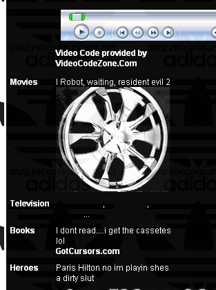
This is absolutely textbook blogging. Back in the internet stone age, they used to preach to aspiring webmasters to create flow charts and site maps BEFORE they created the page to ensure logical progression throughout the page. Now that we have advanced to such a high level of production, this is obviously unnecessary. Observe the seamless progression seen in the above image: Video host links --> Favorite movies --> Random hubcap --> Curious television answer -->Hilarious joke about reading --> Link to a potential spam factory --> Deceptive sarcasm (thankfully acknowledged. whew) While we're here, why does everyone have to throw in an "Oh my God, JK!" after their ridiculous survey answers. As if someone's going to read your answer and say, "Holy shit, Dave's favorite actor is Richard Simmons! What the fuck? I don't even know him anymore! I have to kill him! I have to kill Dave!" Your surveys are sad enough; the feeble comedy attempts just deepen the tragedy. Groups BBallers of America , Basketball - Hip Hop - Rap - Football , BALLAS N ROLLAS , stop torturin dogz , The John Club , COLOMBIAN SEXIES.. Pretty standard. My only comment here is that I hope "stop torturin dogz" was founded to improve the quality of Rick Steiner's life. Details Income: $250,000 and Higher There are more details than this, but this one is my favorite. The majority of Myspace pages I've seen usually display this as the income and with the exception of Tool's Adam Jones, all of the authors are blatant liars. I'm not saying they're trying to fool anyone. In fact, I wish that they were. Instead, this falls back into the "Self, I'm pretty damn clever" survey responses I just touched on. It's the same reason why the authors always list "retired" as their occupations. I understand that a weblog is the not something that reality influences, but originality should at least try and make a comeback in this medium. Since everyone thinks it's cute to use this income figure, it might be a better idea to skip it then to conform to everyone else. Wait a minute, bloggers conforming? Nah, that could never happen.... Huge Blank Space Present Not only present, but imposing. This is the gold standard of space-wasting nothingness that I, like all webmaster, have been tirelessly attempting to achieve.
Back to Blogs Back to Leonardite.com |

